PRE-PRESS
Pre-Press: The Crucial Step Before Printing
Pre-press is a critical stage that ensures the quality of your printed materials. Visit this page to avoid common mistakes in file preparation, select the right colour profile, and access other essential pre-press guidelines. Proper pre-press planning ensures flawless results and smooth printing.
guidelines
File format
PNB Print accepts PDF files (versions 1.4 and above), which can be obtained using the graphic software command Export to PDF in InDesign with Press Quality settings. More details about exporting PDF files can be found here.
If the submitted job consists of several parts, each part must be prepared as a separate PDF file (content pages, end papers, inserts, cover).
Page order
Pages for books and brochures should be a single file.
Pages in the file must be in the same size and orientation (portrait or landscape). In the correct order (first to last) with blank pages, if any.
If the file size exceeds 1GB, it is advised to split the file in parts that are less than 1GB.
Each part of the book needs to be a separate file (content pages, endpapers, cover, etc.) The only exception is a book with selfends (front and endpapers from the content file).
Pages in the content file should be set as individual pages, as spreads aren’t compatible with print technologies.
Print files of the same title should follow the same naming conventions. For example, 1-32-<<tittle>>.pdf
Page sizes must not include decimal numbers.
In case of corrections, only the pages with modifications need to be resubmitted. If there are more than 15 pages of corrections, the whole file needs to be resubmitted (or the part in which these pages are if the file was previously split). Only correction pages that are in order should be in a single file, otherwise they should be resubmitted as individual pages. For example:
- 3-5-<<title>>-NEW.pdf
- 8-<<title>>-NEW.pdf; 13-<<title>>-NEW.pdf, etc.
Don’t resubmit the whole content file if there have been less than 15 pages of modifications. The resubmitted files need to have the same parameters (trim, bleed, art, crop, and Media boxes) as the original file.
Contents with flaps
If a title has flaps in the content, files should be prepared in accordance with specifications that have been given by our technologists or repro.
Flap files should be separate, while still following the naming conventions of the whole title and indicating the pages in question. For example, a title with one flap could be labelled as follows:
- 1. 1-32-<<tittle>>.pdf
- 33-36-<<tittle>-flap.pdf
- 37-68-<<tittle>>.pdf
Bleed and dimensions
If the document has a background colour or images that reach the trim line, they must be extended beyond the trim line to add a bleed. Bleeds should be at least 3mm.
The document size (trim box) should match the size of the finished product, while the bleed should be indicated with the bleed section.
Trim and folding marks
Trim and folding marks should be outside of the 3mm bleed section. Colour bars should not be added to the print pdf.
Safe area
Important elements, such as texts, logos, page numbers and chapter titles should be at least 3mm inwards from the cut and fold lines. Anything closer, due to production offsets, may be partially or fully cut or folded.
Image resolution and colour depth
For colour and greyscale images, the resolution should be 200-300 dpi (dot per inch), and their colour depth should not exceed 8 bits per channel. For 1-bit images, the resolution should be 600-800 dpi. For Japanese rasters (such as manga titles) image resolution should be 1200 dpi.
For image preparation, use our recommended colour profiles which you can find here.
CMYK, RGB, Pantones, Black and Saturated Black
For colour elements, the CMYK colour space should be used. If the file uses RGB colour space, it will be automatically converted to CMYK using PNB Print settings. Be aware that this conversion may lead to a different tone than originally intended.
Black texts and small objects should only contain a single value – 100% black. If they are made of several colour values, this can lead to misalignments that could negatively impact the appearance or legibility of the texts.
For large black objects, to increase the intensity of the colour, you can use a saturated black, following these values: 60-50-50-100 (CMYK).
ICC profiles should be applied to the objects (images), and not be included in the PDF file.
Print files should not include Pantones unless the print is intended with Pantone colours. In cases where the Pantone colours indicate Spot UV or cuts in the content files, these Pantone colours need to be named according to the process they represent, and they should be set to overprint. Additionally, these colours need to be well visible against the file’s design.
When the print is intended in Pantone colours, the colours must use the ones from the official catalogue. For example, PANTONE Red 032 U, PANTONE 871 C etc.
If Pantone colours are used with transparency, overprints or overlay other Pantone colours, the intended print orders should be given.
Overprint settings
While processing the files, we will automatically add overprint to all black objects, while deactivating the overprint for white objects. Overprints for colour and grey objects remain as in the file we receive, which may lead to a slight change in tone if these overprints weren’t intended.
If there are specific requests for overprint or trapping in the file, to achieve the intended result, that contradict the above-mentioned corrections. Inform Repro about this when submitting the files.
You can check the overprints in the pdf file, by using Output Preview and choosing → Preview → Color Warnings → Show Overprint. Overprints will be displayed in your chosen colour.
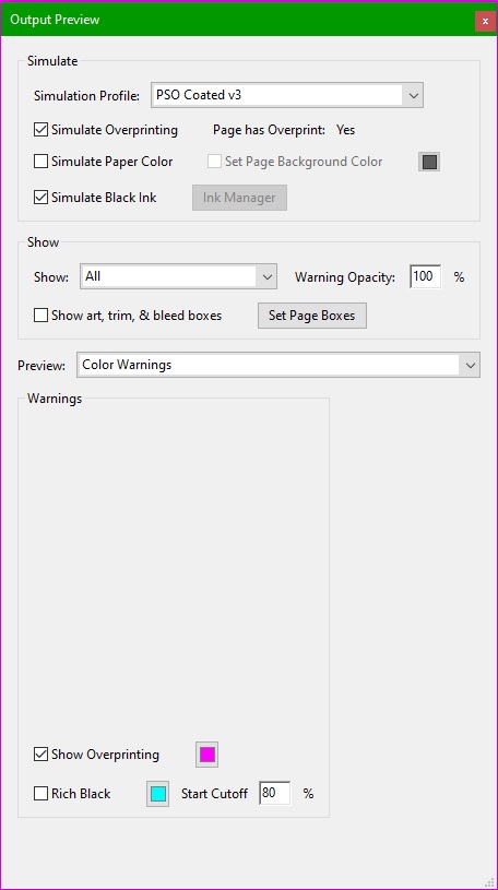
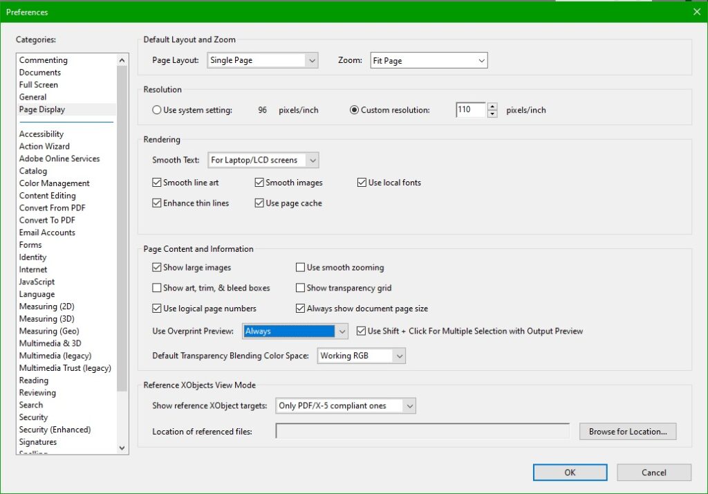
If Adobe Acrobat software isn’t available, as an alternative you can use the free software Acrobat Reader, however, Acrobat Reader doesn’t have the option to Simulate Black Ink. If this parameter isn’t active, black colours on the screen won’t display correctly (will appear much darker) this difference is especially big when the title is intended for print on uncoated paper. It’s important to set Acrobat Reader’s preferences in Use Overprint Preview to Always.
Here you can find a test file, which will let you check if the overprint settings on your PDF viewing software are set correctly for print.
Backgrounds
Content pages with large, homogenous backgrounds that contain more than 2 colour values, may slightly differ between pages.
Endpapers that are homogenous colours, should not contain more than 2 colour values. If the colours have more than 2 values, we can’t guarantee that the tone won’t have slight deviations.
Keep in mind that 1% colour values aren’t stable and might disappear in print.
Fonts
All fonts used must be included in the PDF file.
Varnish, foil, silk print and dielines
UV varnishes, foils and relief elements must be prepared as separate files with 100% black values. If possible, they should be vector objects with texts converted to outlines.
Minimal line elements and gaps between elements for silk print are 0,2mm.
UV varnish and foil on MGI, with elements up to 30 mkm, should be at least 0,5mm wide with 0,5mm gaps to prevent the elements from losing definition or bleeding together. UV varnish should have a 1:1 alignment with the print elements in question.
For hot foil, to prevent a loss of detail or elements bleeding together the parameters are as follows:
- On paper, – 0,15mm element line weights with 0,25mm gaps.
- On materials – 0,25mm element line weights with 0,35mm gaps.
- On cardboard or finished covers (with or without pressure) elements and gaps should be 1mm
If the foil is aligned with print elements, the foil should overlap the printed design by 0,4mm to prevent possible misalignments.
For 3D foil embossing, elements should be at least 0,8mm with 1mm gaps. The overlap of foil embossing with the print elements if applicable, should be 0,1mm.
Embossing and Debossing
Embossing and Debossing files should be separate files, and they should be made as a vectors.
For soft covers embossing and debossing elements should be 1mm wide and have 1mm gaps between elements.
When submitting the file, it’s important to specify if the design is being pushed up or down.
If there is an alignment with print elements, then:
- Print elements pushed down – the print elements should be 0,1mm larger than the deboss.
- Print elements pushed up – the emboss should be 0,1mm larger than the print elements.
Pressure stamping
For pressure stamping, the files should be separate and made as vectors.
For pressure stamping on hardcover books, the elements should be 1mm wide and have 1mm gaps.
It’s important to specify which elements are intended to be raised and which are pressed down. Elements with colour fill on the stamping file, are the ones we consider being pressed down.
If the pressure stamping aligns with the print, then:
- Print elements pushed down – print elements should be 0,1mm larger than the pressure stamp design.
- Print elements raised up – print elements should be 0,1mm smaller than the pressure stamp.
Line thickness
For light elements over dark colours (more than 2 colour values), line thickness should be 0,2mm. If lines are smaller than this, then the elements could get muddied in print.
For elements consisting of more than 2 colours, line weights should be 0,15mm.
Covers, dustjackets and endpapers
Cover files should be prepared in accordance with the layout generated on c.pnbprint.eu, or by the ones requested.
- For soft covers, the spine and 3mm next to the spine on each side should be left blank, for better results during gluing.
- Images that are intended to align between the 2nd and/or 3rd covers with the content pages, should have a 6mm compensation, as the cover is glued to the content for 6mm. Accordingly, this also means that any important texts or elements should be 9mm from the spine on both the inside cover and the first and last pages of softcover content files.
- For hardcover books with flat spines, we recommend that the spine design is extended by 0,5mm on each side for better results if the spine’s design is different than that of the 1st and 4th covers.
You can find examples of cover layouts here.
Colour proofs
Customer colour proofs must conform to the ISO 12647-7:2016 standard, with FOGRA51 or FOGRA52 print simulation. They must also contain the UGRA/FOGRA Media Wedge v3 control scale and the date of manufacture. If printing on papers or materials with a different surface whiteness than those on the colour proof, the print may not match the colour proof. Colour proof is a target for the print process and as such, may not match the final product if the product is laminated or varnished after print.
Exporting files
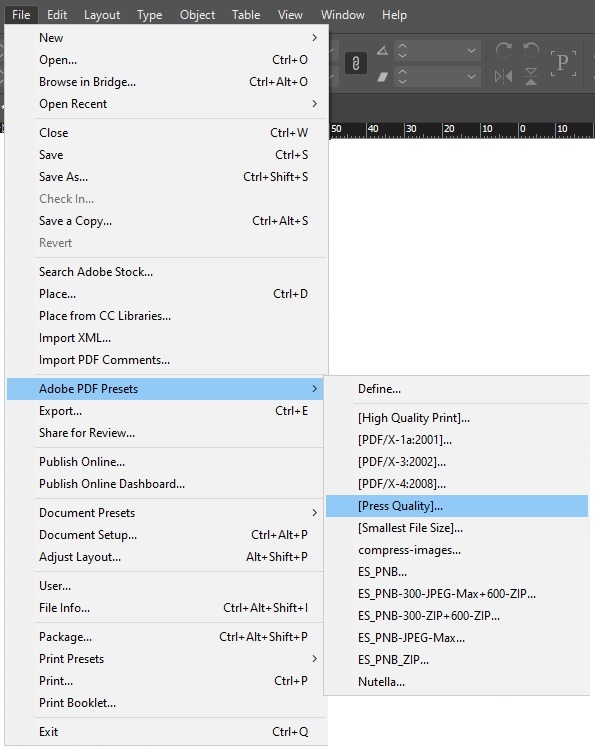
Export from Adobe InDesign using the Adobe PDF Presets.
When exporting, on the tab General, the “Optimise for Fats Web View” setting should be turned off.
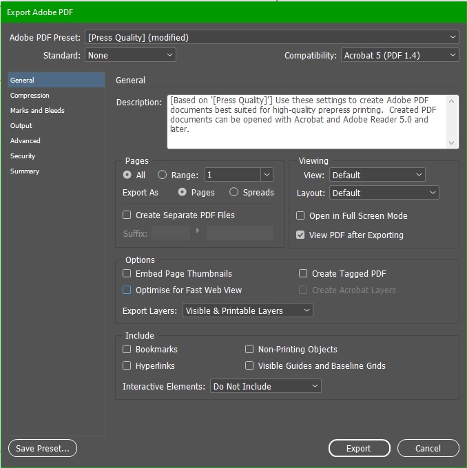
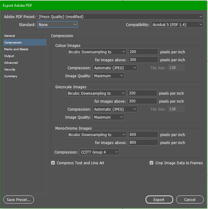
On the Compression tab, the settings should be as in the image below.
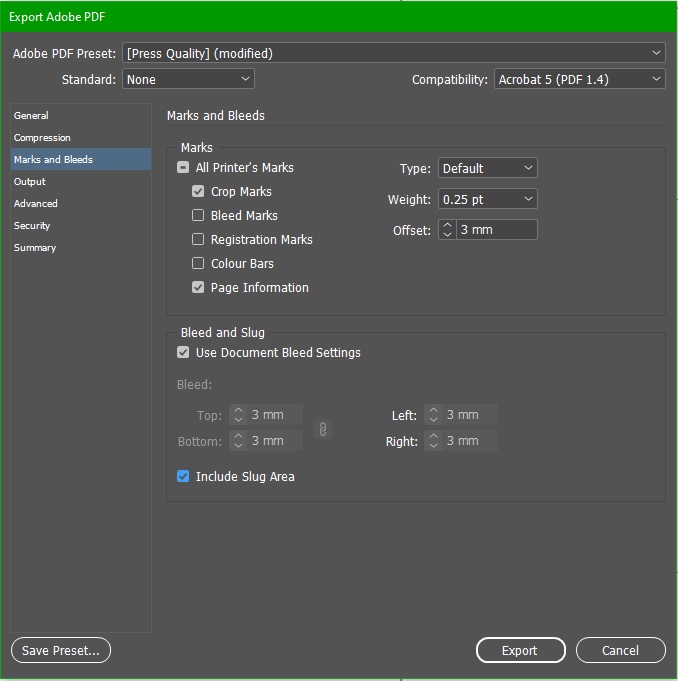
On the tab Marks and Bleeds – Crop Marks, Page Information and Include Slug Area may be included if you wish. But if these are included, the Offset must be set to 3 mm.
All bleeds should be set to 3 mm.
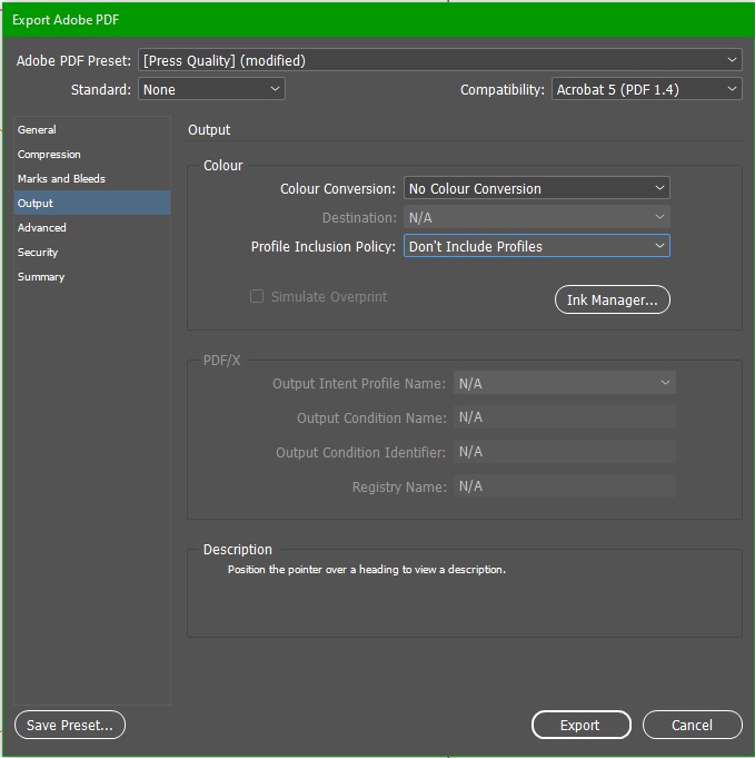
Settings on the Output tab should be as in the image below.
On the tabs Advanced, Security and Summary parameters don’t need to be changed.
ICC Colour Profiles
How to prepare images, using ICC colour profiles.
There are many types of paper that can produce different results when printed because the colour reacts differently to different surfaces of paper. For example, on uncoated paper, the paper fibres are more absorbent of the colour, whereas, on coated paper, the colour mostly dries and remains on the coating. Many other chemical and mechanical processes are different for various papers.
The best way to account for these processes is to prepare images for printing by using ICC colour profiles.
PNB Print uses and recommends that their clients use, ECI (European Color Initiative) developed ICC profiles. Which are based on the international ISO 12647-2 standard.
PSO Coated v3 (FOGRA 51) colour profile is for print on all coated papers, both glossy and matte. The total amount of ink is limited to 300%.
Link – PSO Coated v3
PSO Uncoated v3 (FOGRA52) colour profile is for print on all uncoated papers. The total amount of ink is limited to 300%.
Link – PSO Uncoated v3
For Windows operating systems, the colour profiles should be placed in the folder C:\WINDOWS\system32\spool\drivers\color.
For MacOS X colour profiles should be placed in the folder /Library/ColorSync/Profiles or /Users/YourName/Library/ColorSync/Profiles
An image, that you want to prepare for print, should be opened in Photoshop and converted to the appropriate profile, using the Convert to Profile, which can be found under Edit -> Convert to Profile.
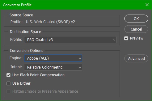
Destination Space Profile should be the profile which corresponds to the paper on which the image will be printed (PSO Coated v3 for coated papers, PSO Uncoated v3 for uncoated papers).
The Engine should be Adobe (ACE), and the Use Black Point Compensation should be turned on.
Intent should be set to Relative Colorimetric.
Special profiles
coated_FOGRA39_GCR_bas – colour profile used for black and white images that have all 4 CMYK values and are printed on coated papers. It makes the black value dominant, increasing the depth of the image and stabilizing it for print to prevent any unwanted tints. The total amount of ink is limited to 300%.
Link – Coated FOGRA39 GCR
uncoated_FOGRA29_GCR_bas – colour profile used for black and white images that have all 4 CMYK values and are printed on uncoated papers. It makes the black value dominant, increasing the depth of the image and stabilizing it for print to prevent any unwanted tints. The total amount of ink is limited to 300%.
Link – Uncoated FOGRA29 GCR
uncoatedYellow_FOGRA30_GCR_bas – colour profile used for black and white images that have all 4 CMYK values and are printed on uncoated papers with a yellow tint. It makes the black value dominant, increasing the depth of the image and stabilizing it for print to prevent any unwanted tints. The total amount of ink is limited to 280%.
Link – Uncoated Yellow FOGRA30 GCR
Uploading files
Files are uploaded to our cloud server, where each client receives an access link to their folder and corresponding password.
How to evaluate web proofs
PNB Print generates webproofs for client approval with 300dpi resolution, in a pdf file.
The file needs to be viewed in Adobe Acrobat with Simulate Overprint and Simulate Black Ink options turned on.
Spine calculator
2023.07.29